PROJECT : LSB & BIOGuard Identity
Complete rebranding for La Salle Blanche, a B2B company specializing in cleanroom environments and microbiological testing. The visual identity reflects scientific rigor, purity, and control, with a minimal and structured design language.
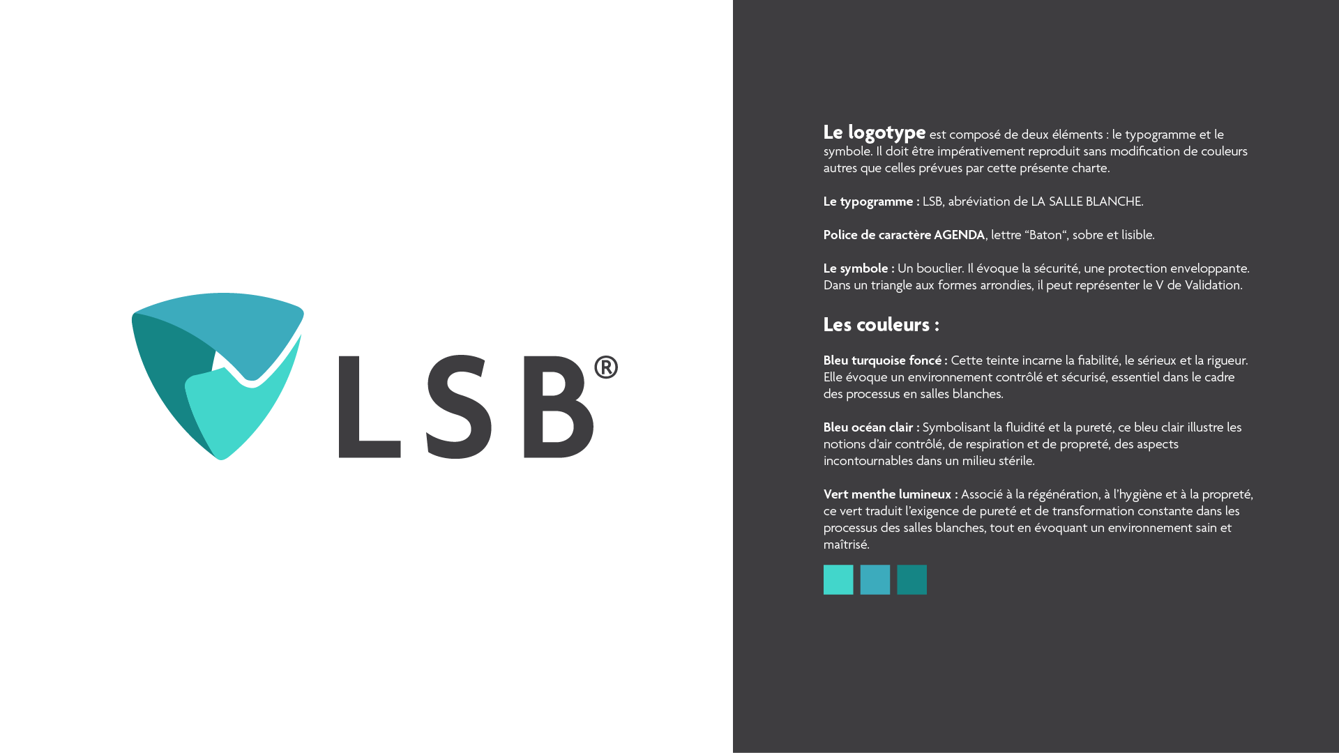
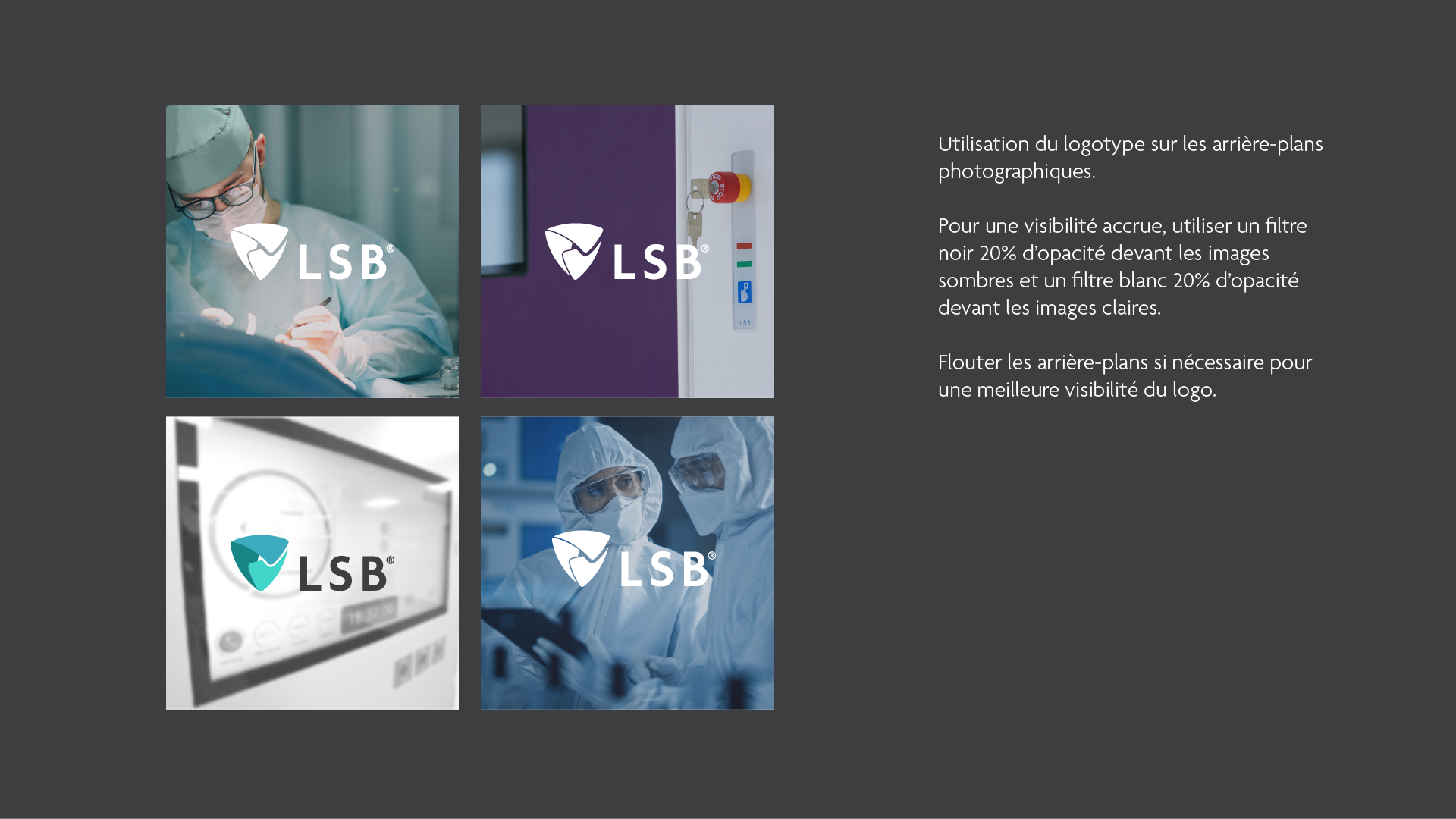
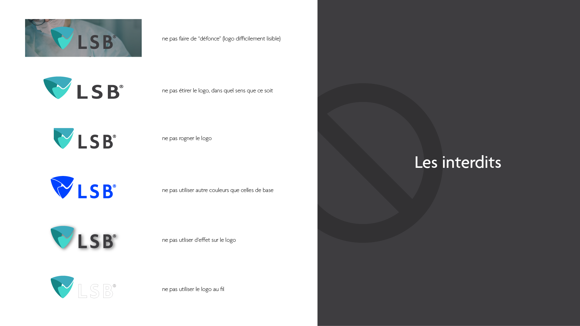
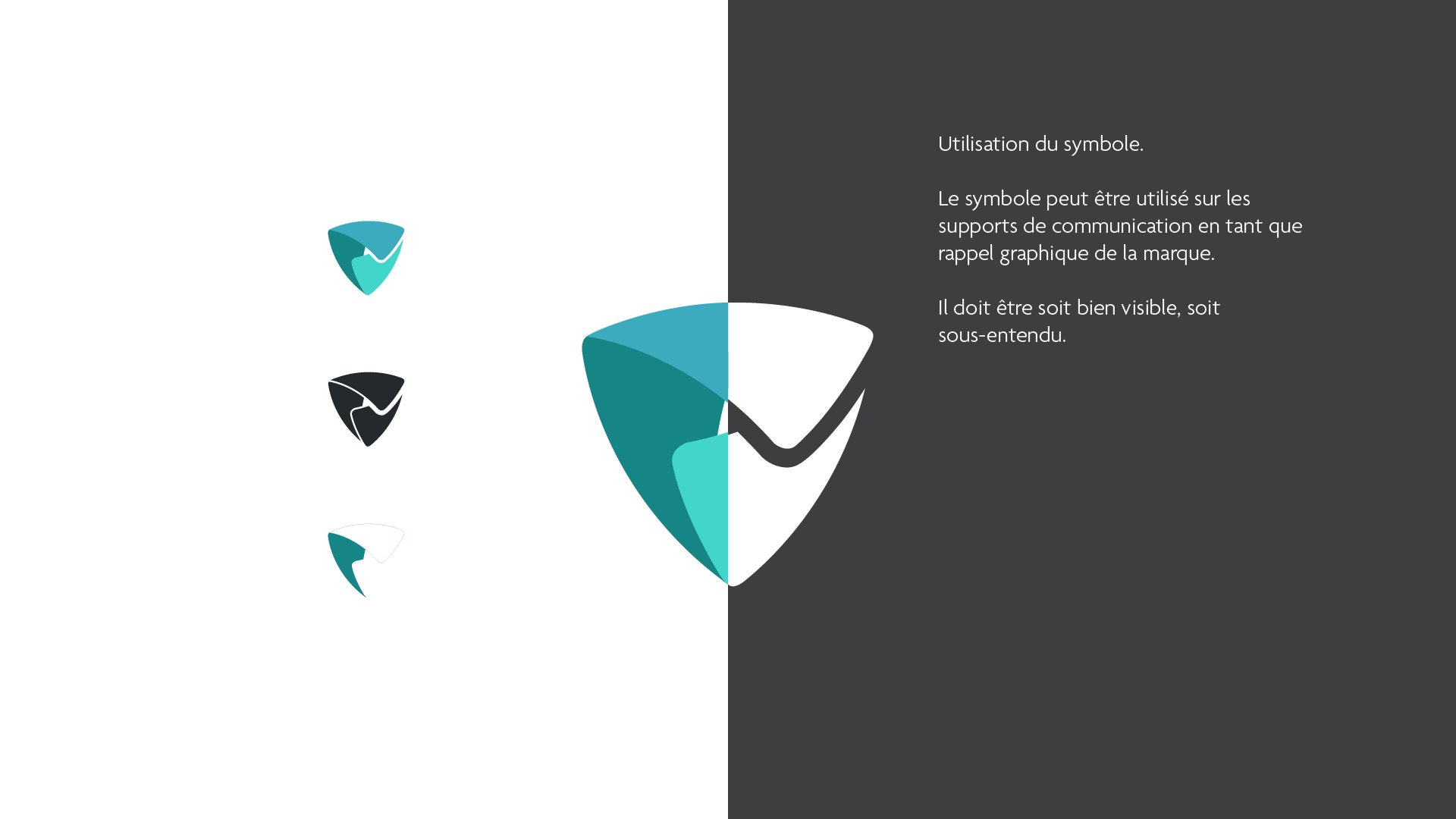
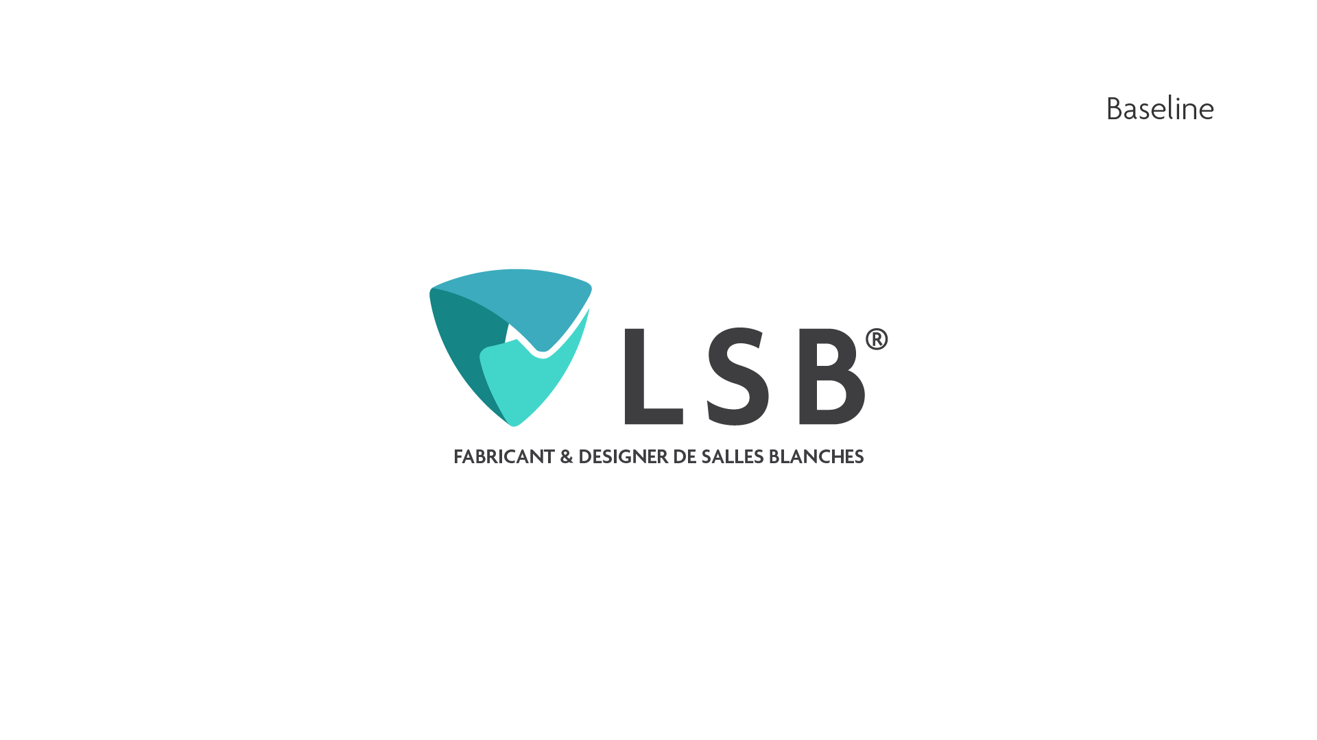
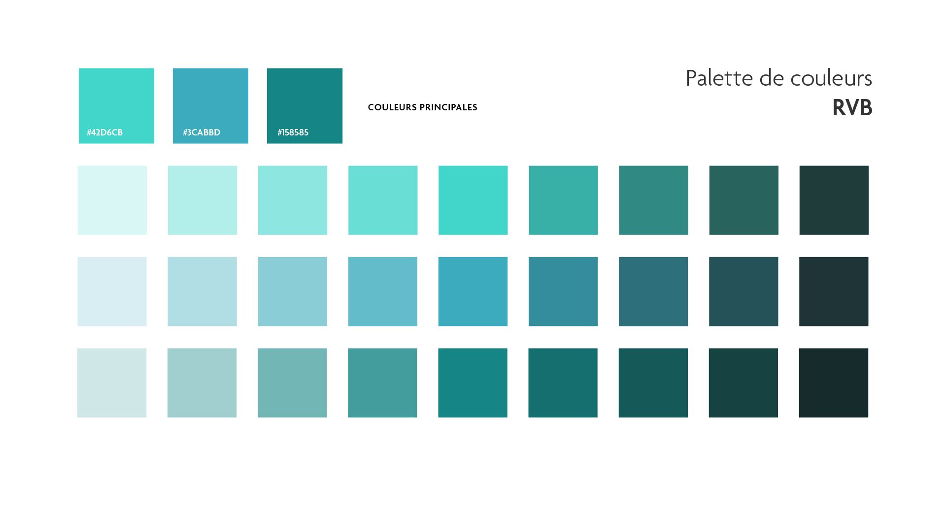
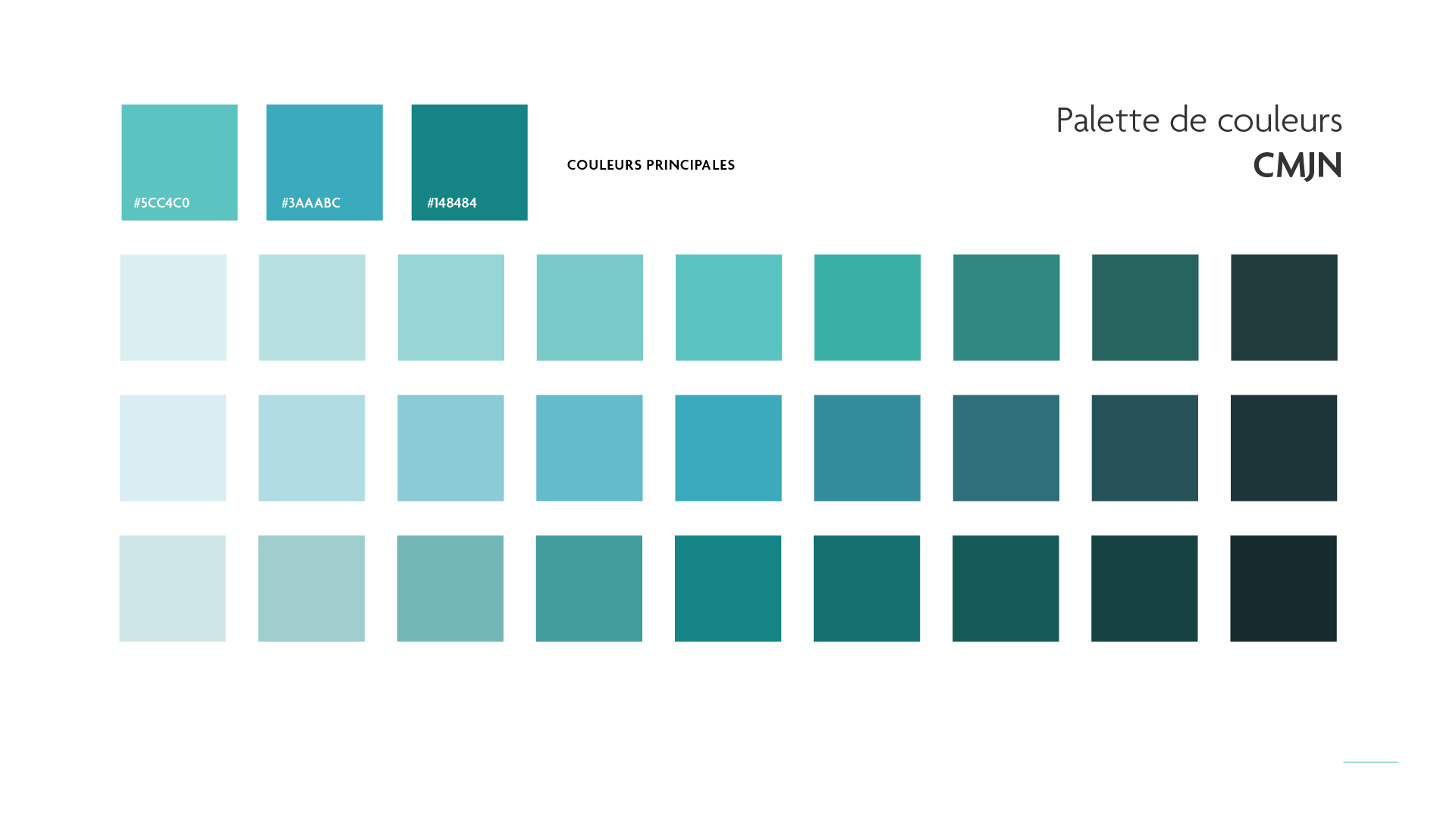
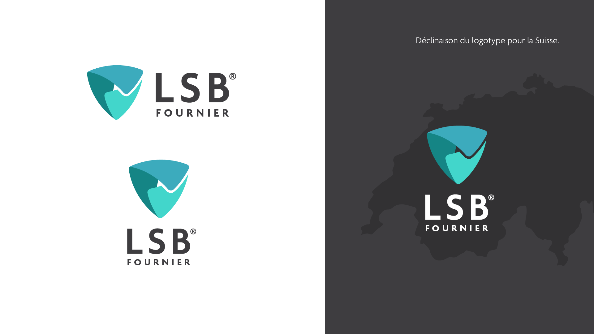
The La Salle Blanche logotype uses a bold, geometric sans-serif font in uppercase, conveying precision and reliability. It is paired with a soft triangular shield symbol—rounded and balanced—representing protection, validation, and structural integrity. The color palette blends mint green, turquoise, and deep teal, chosen to evoke cleanliness, air purity, and a controlled sterile environment.
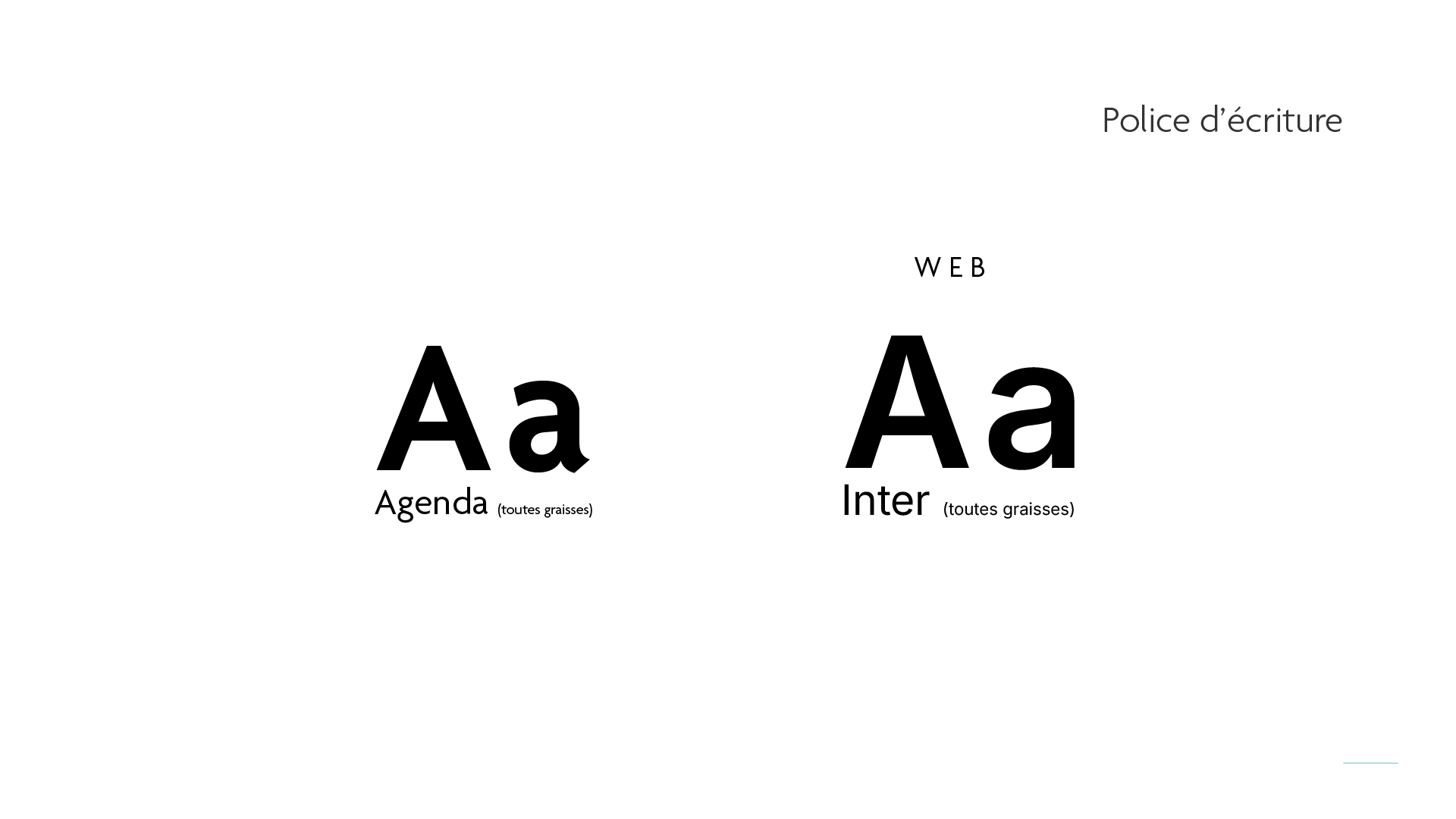
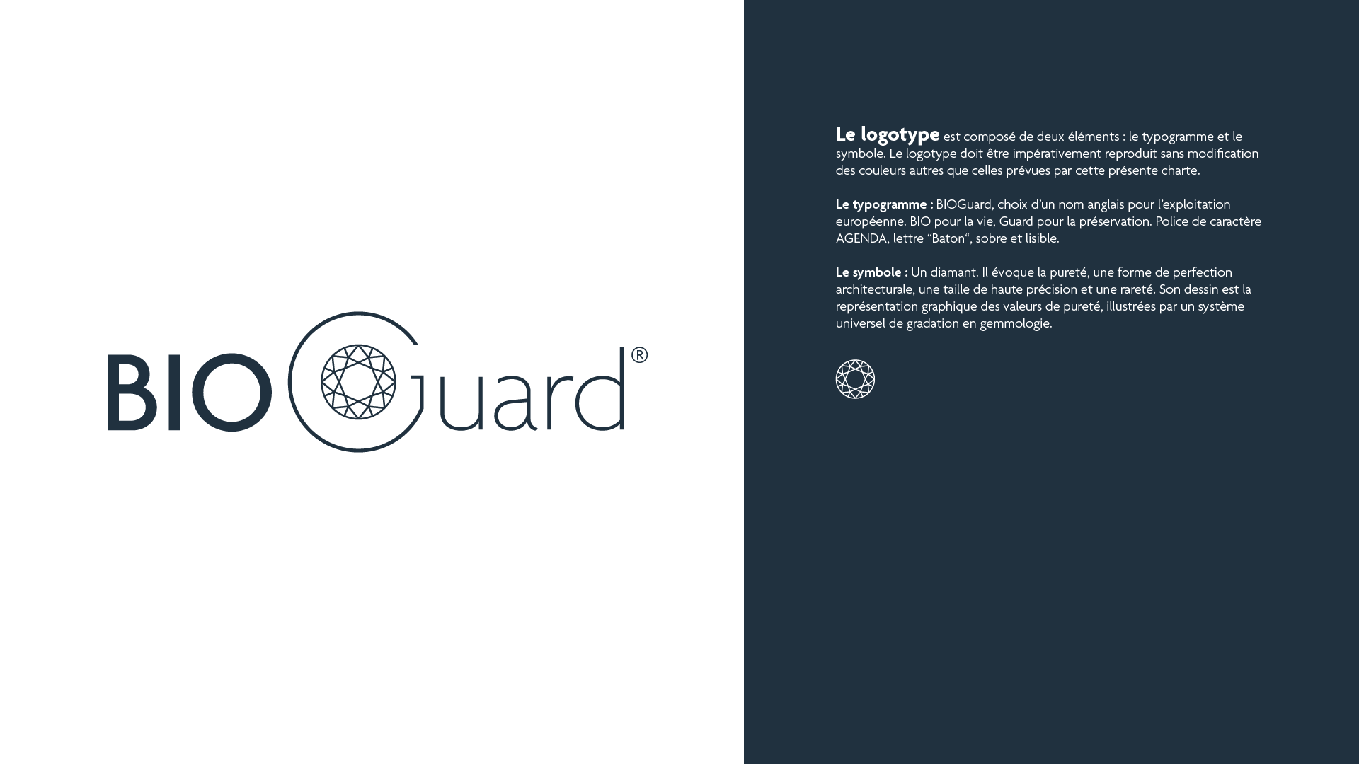
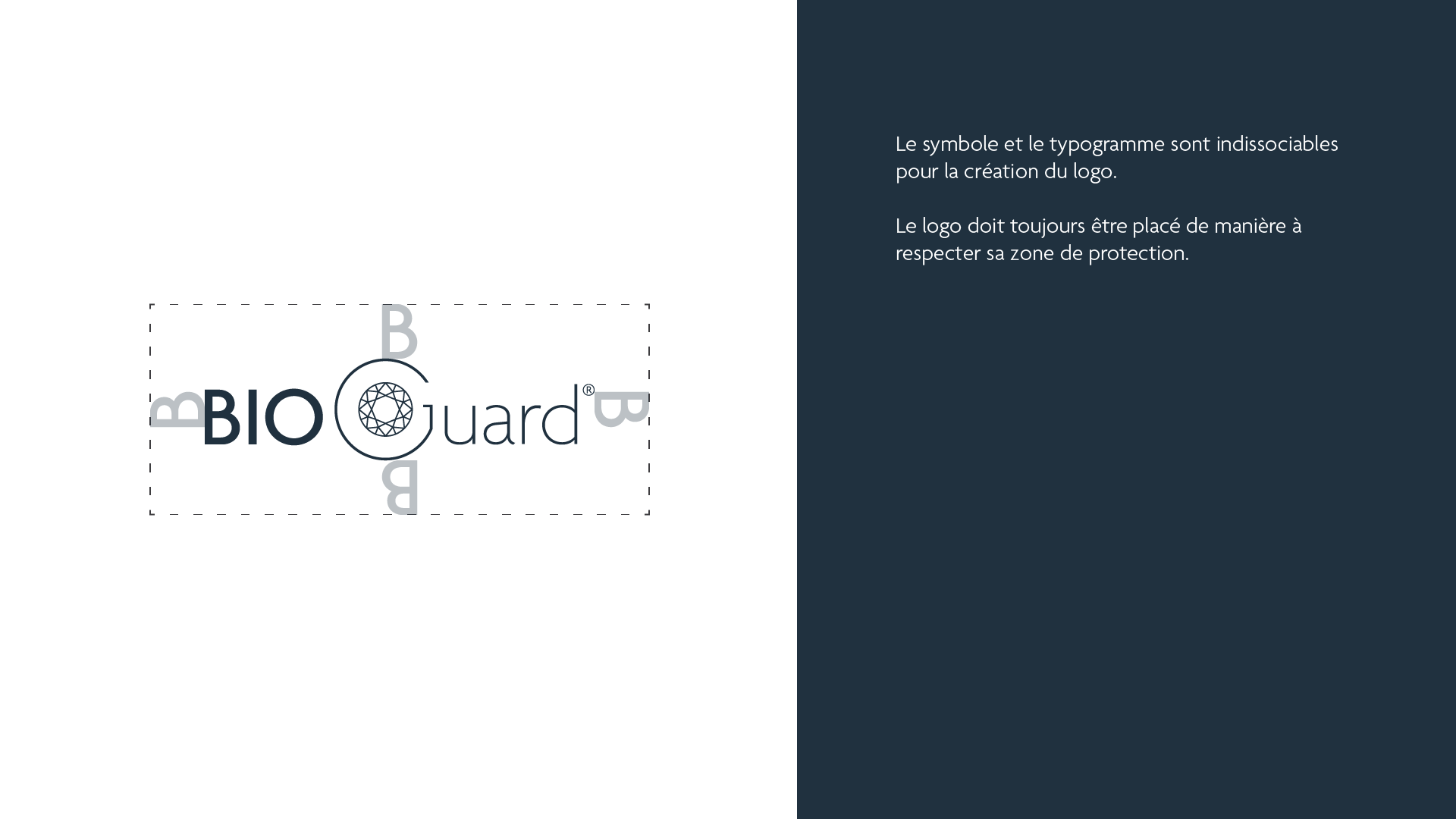
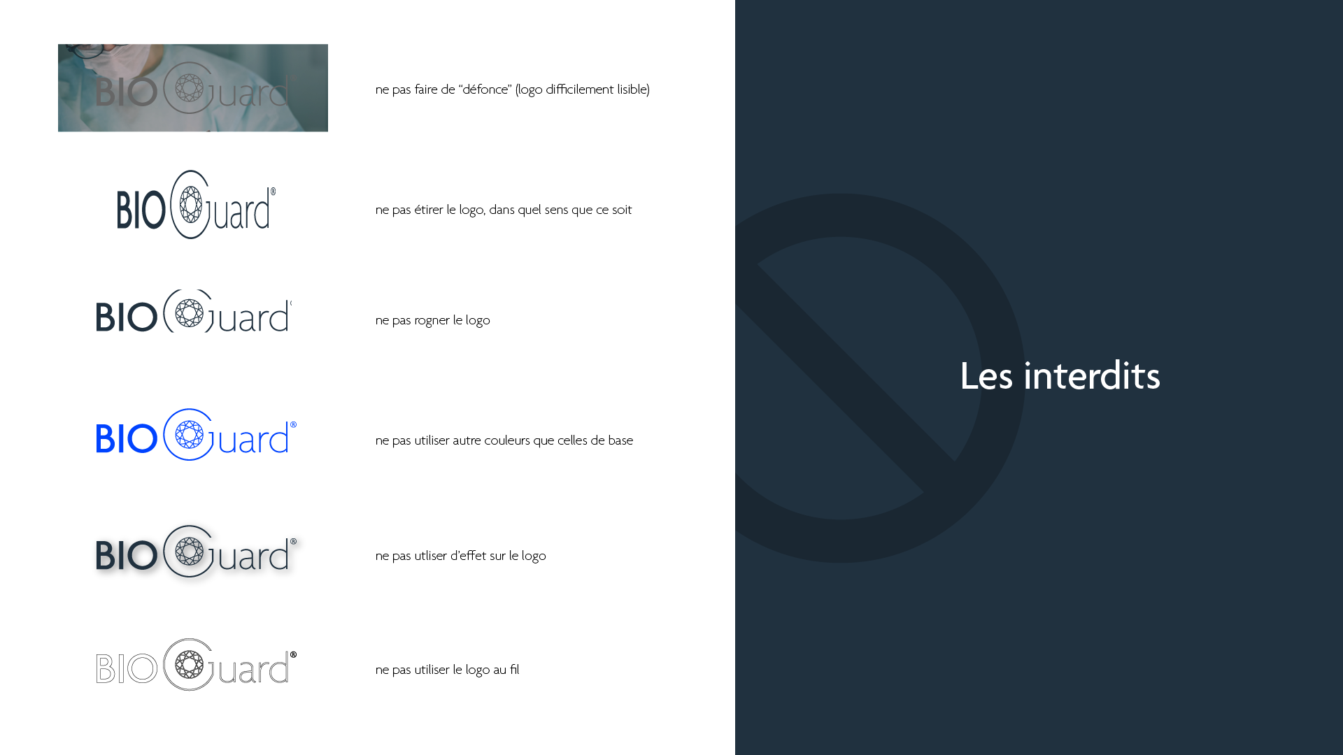
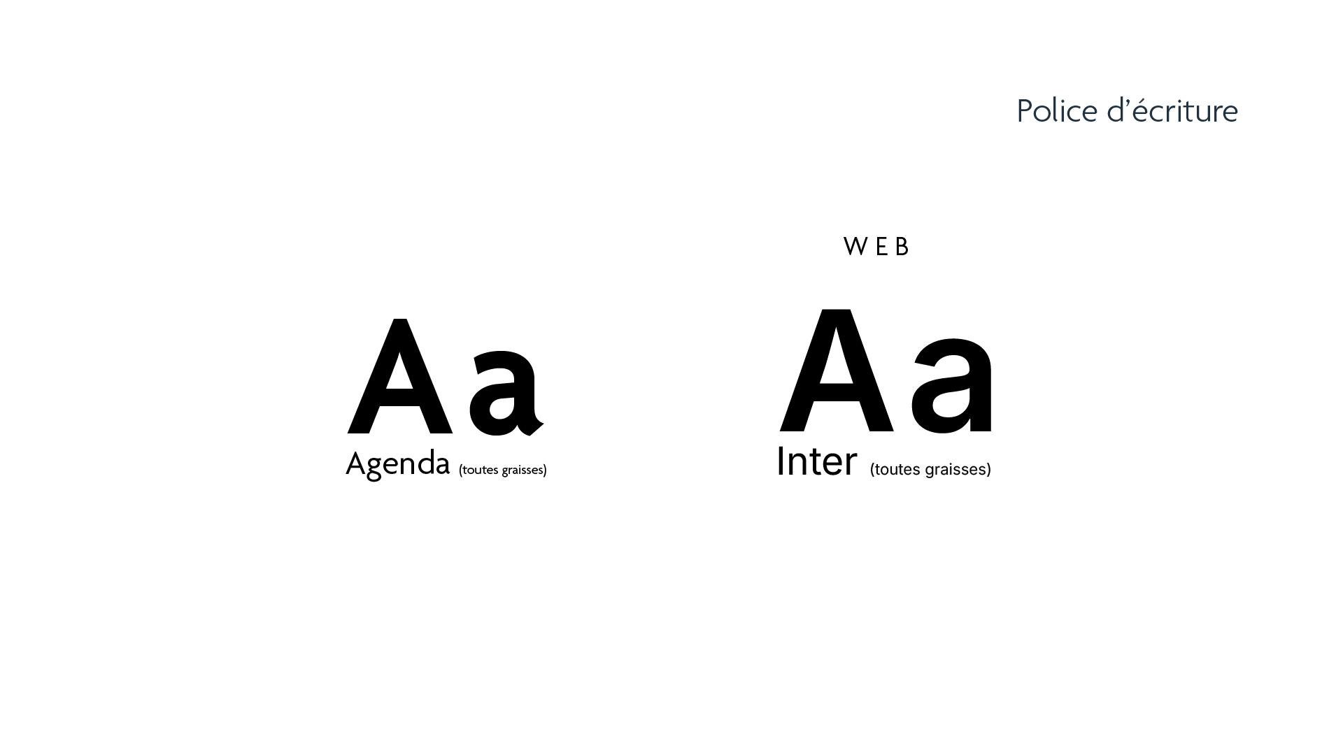
The identity for BIOGuard, a product range developed under LSB, builds on this foundation while asserting a more specialized tone. The BIOGuard logo is composed of a clean wordmark set in AGENDA, a highly legible sans-serif, combining the terms “BIO” (life sciences) and “Guard” (protection).
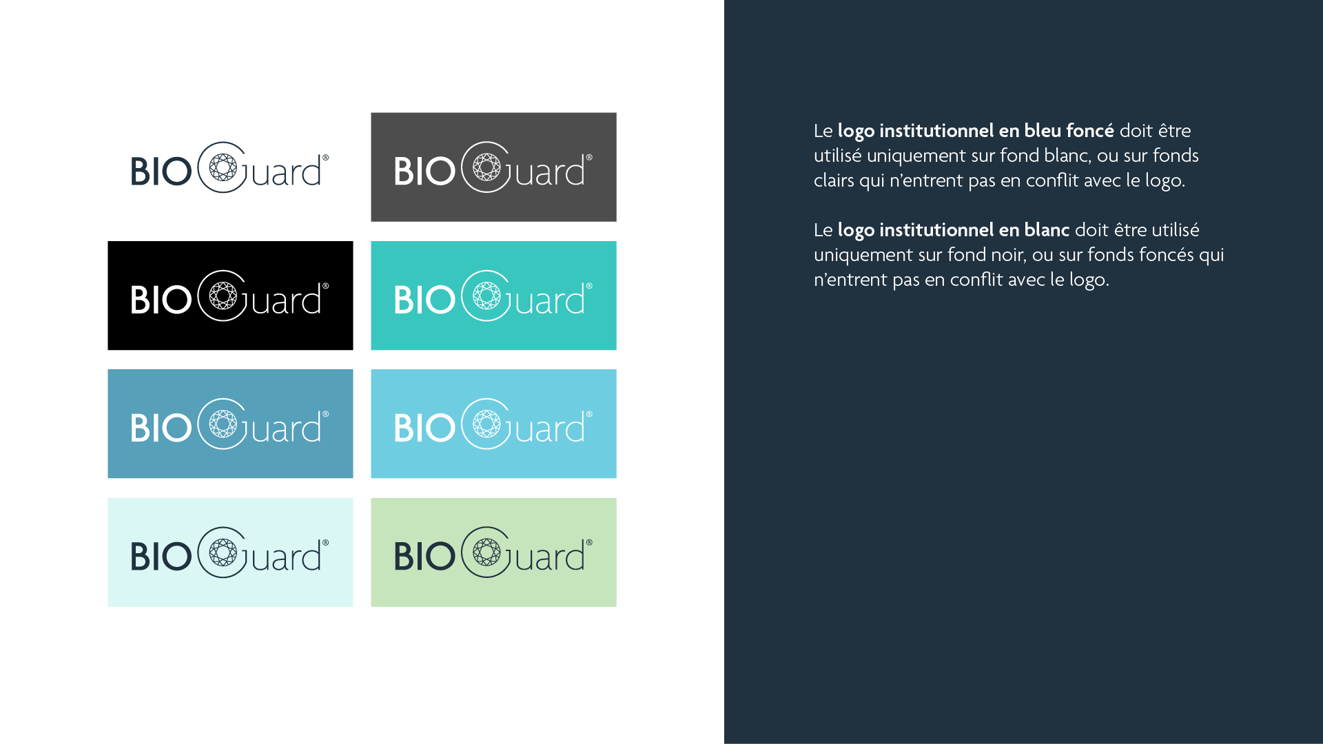
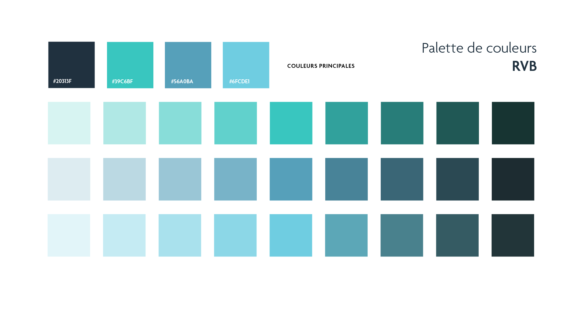
Its visual symbol is a diamond, representing purity, solidity, and high precision—mirroring the exacting standards of microbiological testing. The diamond is subtly faceted, referencing gemmology standards, and embodies the values of clarity and excellence. The color scheme features deep blue, aqua green, and soft cyan, offering a calm yet highly professional look.
