PROJECT : Enzo's personal branding
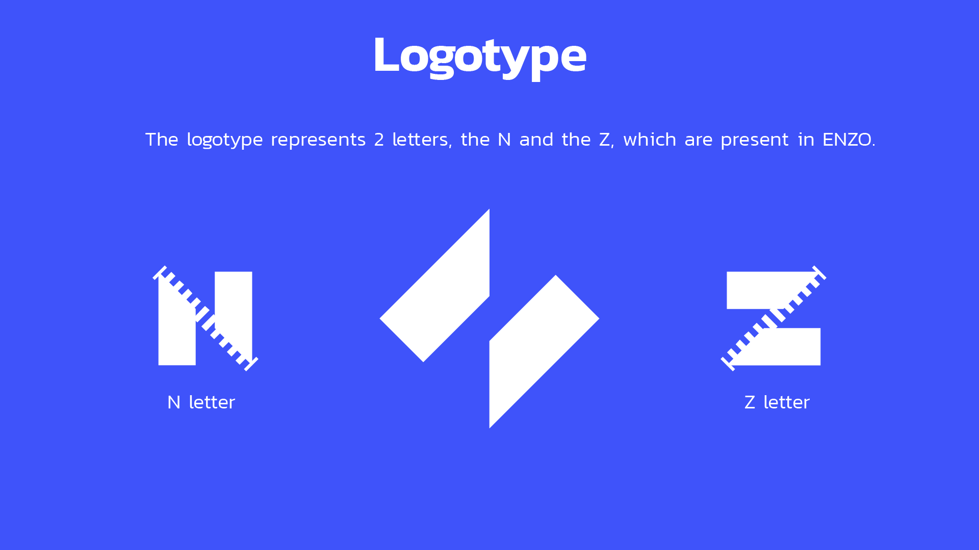
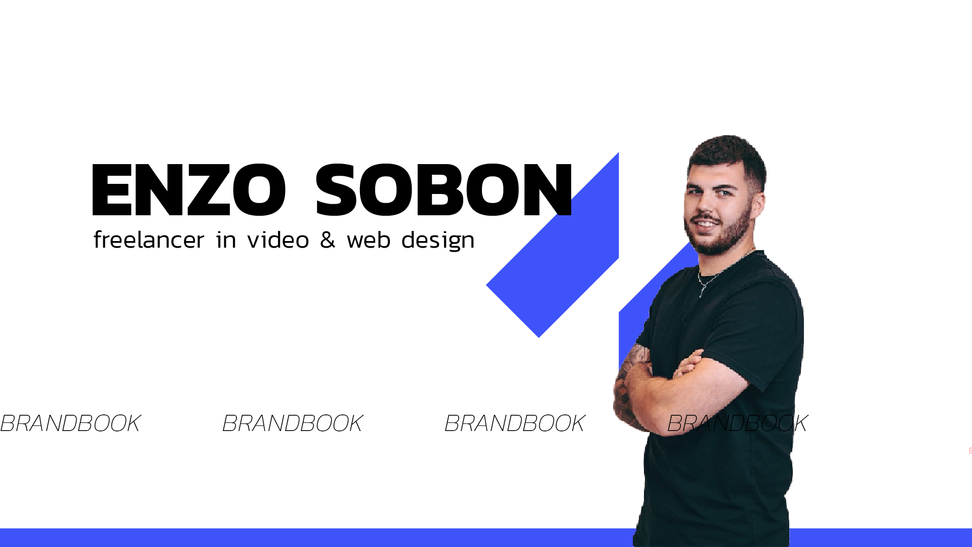
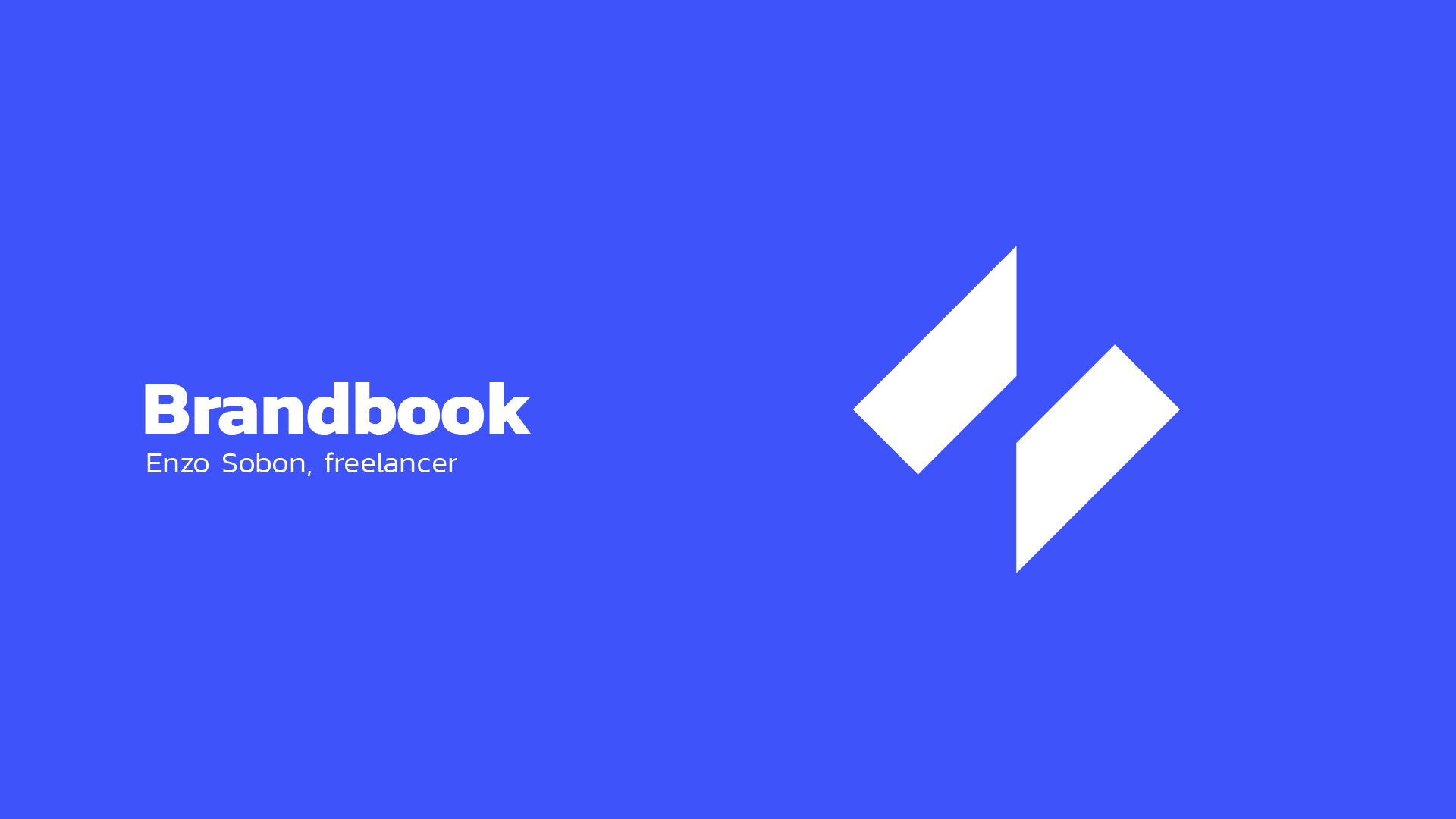
This project presents a personal brand system designed for a freelance video and web designer. The logotype is a minimalist visual combination of two stylized shapes, representing the letters “N” and “Z” found in the name ENZO. These geometric cuts give the logo a modern, angular look while maintaining clarity and uniqueness.
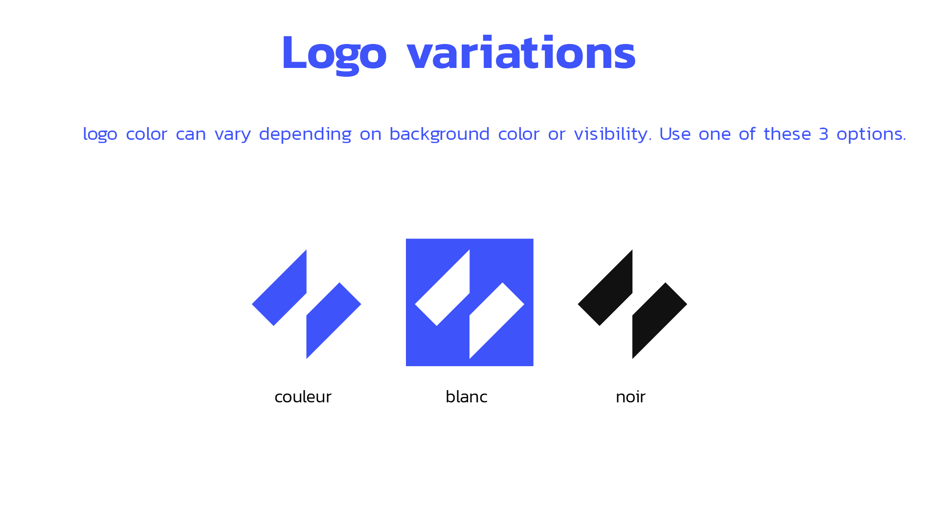
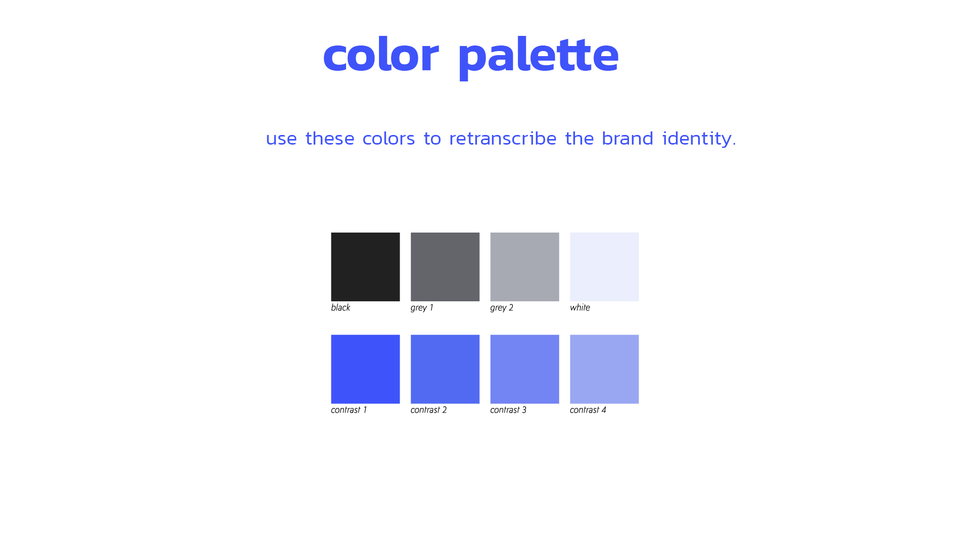
The identity is built around a bold electric blue, paired with shades of black, gray, and white for balance and flexibility. A range of logo variations—color, white, and black—ensures strong legibility across multiple backgrounds and use cases.
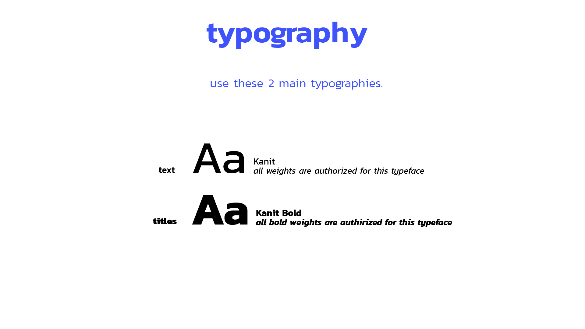
Typography plays a key role in reinforcing the tone of voice: the Kanit typeface is used in regular weight for body text and in bold for impactful titles. This type choice supports a tech-inspired and contemporary aesthetic.
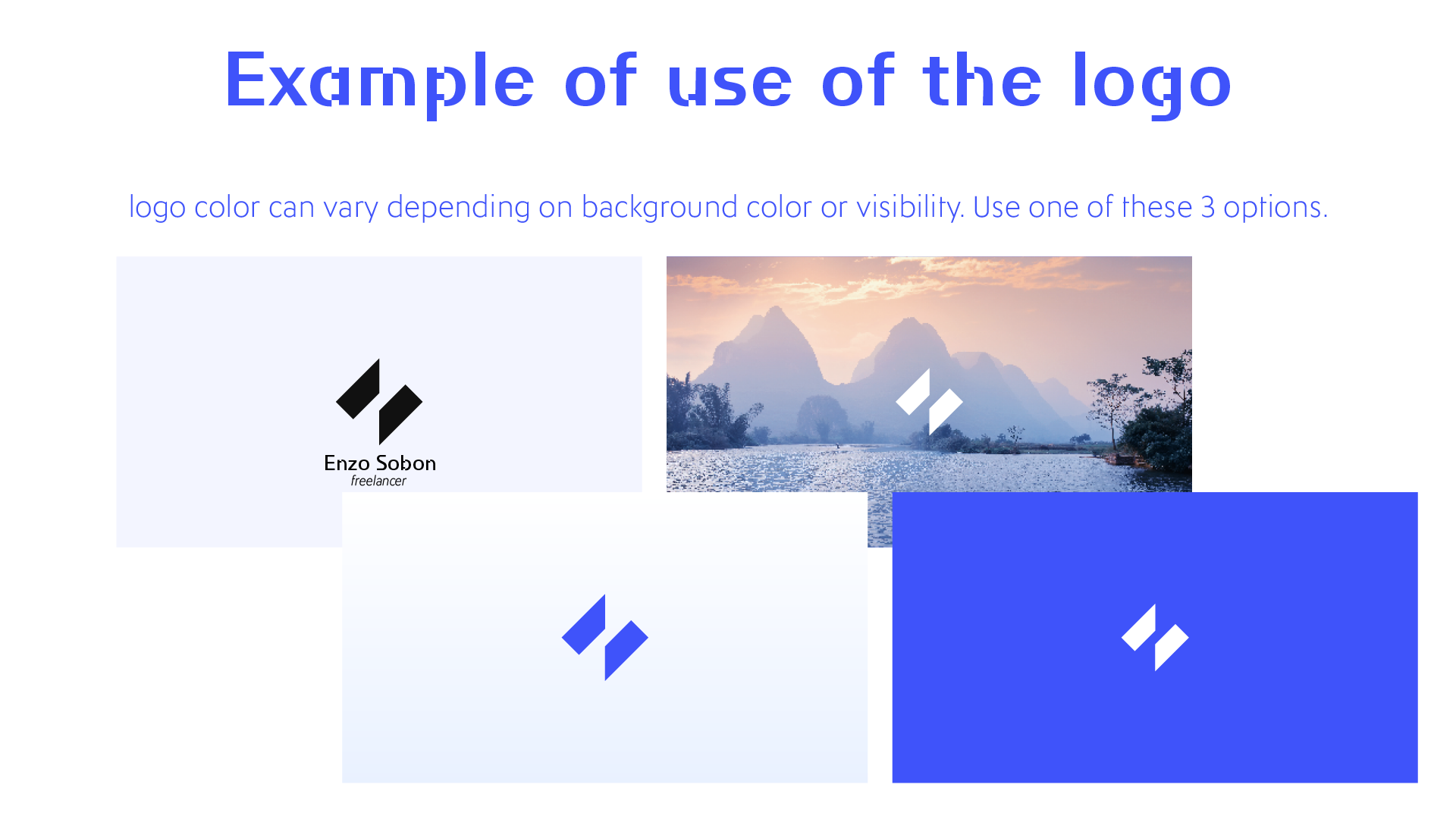
Applications include logo usage in different contexts, a versatile color palette with contrast levels, and a consistent typographic system. The overall brand expression combines clarity, personality, and adaptability, effectively representing the designer’s digital expertise.
